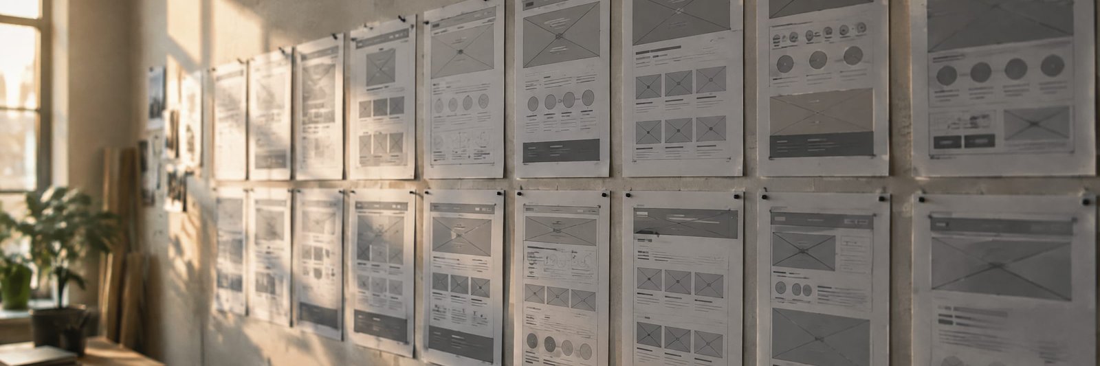
A brochure lists what you do. A homepage has a few seconds to explain why it matters — and one job: move the right visitor to the next step.
Most homepages are written like the back of a brochure. A logo, a paragraph about the company's founding, a grid of services, a few logos and a contact link. Every item is true. None of it is persuasive.
The brochure habit
Brochures were designed for people who had already chosen to pick them up. They could afford to be complete, because the reader was committed. A homepage has no such luxury. Its visitor arrived from a search result, an ad or a colleague's link, and is deciding — quickly — whether to stay.
That changes the job. The homepage is not an inventory. It is an opening argument.
Completeness is not clarity. The page that says everything usually says nothing a visitor remembers.
Three questions, in order
Every effective homepage answers the same three questions before a visitor scrolls far. We will explore each one in its own journal article. In short:
- Is this for me? The visitor needs to recognize their situation in the first line.
- Why you? One reason, stated plainly, that a competitor could not say.
- What now? A single, obvious next step.
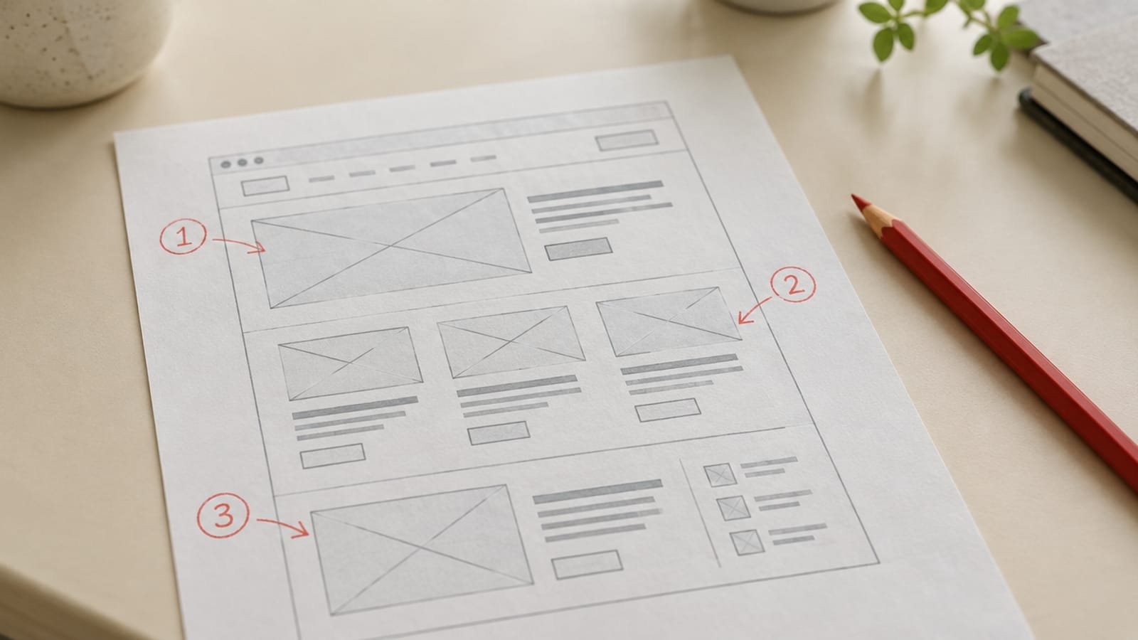
Start with the sentence
Before any layout, write the one sentence the homepage exists to say. If the team can't agree on it, no amount of design will fix the page. If they can, every other decision gets easier: what to include, what to cut, and what the visitor should do next.
Then cut
- Remove any section a first-time visitor wouldn't miss.
- Move proof — results, names, numbers — above claims.
- Keep one primary action visible at every scroll depth.
The result is usually shorter, calmer and far more effective. Not because it says less, but because it says one thing well.